

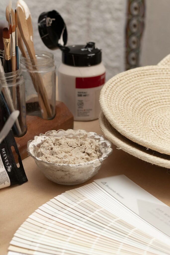
Choosing paint color is easier when the decision starts with the room itself rather than a color trend. Natural light, room size, flooring, furnishings, and the way a space is used all affect how a color will look and feel.
For homes in Pinehurst, NC, seasonal sunlight, warm outdoor surroundings, and common preferences for comfortable, livable interiors can also influence the best choice. A color that looks balanced in a shaded room may appear much brighter in strong afternoon light, so testing the color in the actual space is essential.
How does natural light affect paint color?
Natural light can change the appearance of paint throughout the day. A color viewed in the morning may look noticeably different by late afternoon or under artificial lighting at night.
Rooms with northern exposure often receive cooler, more muted light. Warm whites, soft beige, muted taupe, and gentle greige can help keep these spaces from feeling cold. Southern exposure usually brings stronger, warmer light, which may make warm colors appear more intense. Cooler neutrals, softened greens, and blue-gray shades can help balance that effect.
Eastern-facing rooms tend to receive bright morning light and become quieter later in the day. Western-facing rooms may feel more subdued in the morning but warmer and brighter in the afternoon.
Before choosing a color, observe the room at several times:
- Morning
- Midday
- Late afternoon
- Evening with the lights on
Paint samples should be viewed on more than one wall because reflected light can vary across the room.
Should a small room be painted a light color?
Light colors can make a small room feel more open, but they are not the only option. A darker or more saturated color can create a comfortable, intentional atmosphere in a compact space, especially in bedrooms, reading rooms, or dining areas.
For a brighter appearance, consider:
- Soft white
- Pale sand
- Light greige
- Muted sage
- Powder blue
- Warm cream
The undertone matters as much as the overall depth of the color. A light gray with a blue undertone may feel cool and crisp, while a light gray with beige or taupe undertones may feel warmer and more relaxed.
Painting the ceiling a lighter version of the wall color can make the room feel taller. Using the same color on walls and trim can also create a smoother visual transition, particularly in rooms with limited natural light.
How should flooring and furnishings influence the decision?
Paint should coordinate with permanent or costly elements already in the room. Flooring, countertops, cabinetry, stone, tile, window treatments, and large furniture pieces often have undertones that are easy to overlook.
A wood floor may appear yellow, orange, red, brown, or gray depending on its finish and age. A stone surface may contain subtle flecks of cream, green, tan, or blue. The paint does not need to match these colors exactly, but it should not fight them.
To compare options, place sample boards near:
- Flooring
- Upholstery
- Cabinets
- Countertops
- Large artwork
- Window coverings
Avoid judging a color against a completely empty wall if the room will be furnished. Surrounding materials affect how the paint is perceived.
A useful approach is to identify the dominant undertone in the room and choose a paint color that either supports it or provides a deliberate contrast. For example, warm wood floors often pair comfortably with warm whites, earthy greens, and muted blue-green shades.
What is an undertone, and why does it matter?
An undertone is the subtle color beneath the main appearance of a paint shade. Two samples labeled “white,” “gray,” or “beige” may look very different because one contains yellow, pink, blue, green, or violet undertones.
Undertones are especially noticeable when two similar colors are placed beside each other. A beige with a pink undertone may appear rosy next to a yellow-toned cream. A gray with a blue undertone may look distinctly cool beside warm wood.
To identify an undertone, compare the sample with a clean white sheet of paper and with the room’s fixed materials. Viewing several related colors together can also reveal which shades lean warm or cool.
If the undertone is difficult to identify, use a larger sample and view it under both daylight and the room’s electric lighting. Small paper chips often hide nuances that become obvious across a larger area.
How many colors should be used throughout a home?
A home does not need to use one color everywhere, but a connected palette usually creates a more comfortable flow. This is particularly helpful in open floor plans, where several spaces are visible at the same time.

A simple whole-home palette may include:
- One primary neutral for larger shared areas
- One or two supporting colors for bedrooms or private rooms
- A deeper accent shade for a study, entry area, or architectural feature
- A consistent trim or ceiling color
Colors should relate through similar undertones, depth, or overall mood. For example, a warm off-white, muted olive, and soft clay color may work together more naturally than a collection of unrelated bright shades.
Hallways and transition spaces can use a quieter version of nearby room colors. This prevents abrupt changes and helps the home feel visually connected.
What colors work well with Pinehurst’s local setting?
The area’s warm seasons, outdoor greenery, and abundant natural surroundings can make earthy and softened colors feel appropriate indoors. Shades inspired by sand, clay, pine, stone, linen, and weathered wood often provide a calm foundation without appearing stark.
That does not mean every room should be beige or green. Cooler shades can work well when they are softened rather than highly saturated. A muted blue, gray-green, or dusty teal may provide color while remaining compatible with natural materials and changing seasonal light.
Homes with strong afternoon sun may benefit from colors that are slightly less intense than expected. Bright sunlight can amplify yellow, orange, and red undertones. Testing a sample before painting the entire room helps prevent an unexpectedly vivid result.
How should paint samples be tested?
Paint samples should be tested on large movable boards whenever possible. A small square directly on the wall can be misleading because the existing wall color may influence the sample.
Place sample boards on different walls and move them around the room during the day. Keep them near trim, flooring, cabinetry, and major furnishings. View the samples from across the room rather than only from close range.
Allow the samples to remain in place for at least a full day. A color that seems attractive in bright daylight may look too dark, too cool, or too yellow under evening lighting.
Flat sample cards are useful for comparison, but the final finish can also affect the appearance. Matte and eggshell finishes generally soften reflection, while satin finishes reflect more light and may make a color appear slightly brighter.
Which finish is appropriate for each room?
The finish should match the room’s use and the condition of the walls.
- Flat or matte: Useful for ceilings and low-traffic areas because it reduces visible reflection.
- Eggshell: A common choice for living rooms, bedrooms, and hallways because it offers a soft appearance with moderate cleanability.
- Satin: Practical for areas exposed to moisture or frequent handling, such as kitchens, bathrooms, doors, and trim.
- Semi-gloss: Often used for trim and surfaces that need greater resistance to cleaning and wear.
Paint sheen can emphasize wall imperfections. Higher-sheen finishes reflect more light, so uneven surfaces may be more noticeable. A lower-sheen finish can create a calmer appearance on walls with minor texture.
What common paint-color mistakes should be avoided?
The most frequent mistake is choosing a color from a small sample without testing it in the room. Other problems include ignoring undertones, matching paint to one isolated object, and selecting a color based only on how it appears in a showroom or on a screen.
It is also easy to choose a color that is too saturated for a large wall. A bold shade on a small sample may become overwhelming when repeated across an entire room. If a color feels almost right, a slightly grayer or lighter version may be easier to live with.
Finally, consider how the room connects to nearby spaces. A paint color can look appealing on its own but feel out of place when viewed from an adjacent hallway or open living area. The best choice usually supports both the individual room and the broader character of the home.